Keep the Change
Change. I can’t think of anything so inevitable or so vital to our growth, to our fulfillment as human beings. But as human beings, our natures often tend to resist change. Why is that?
In part, it’s fear of the unknown. If you’re familiar with the expression, the devil you know is preferable to the devil you don’t know, you’re aware of the fact that our fear of change often supersedes our desire to change. Maybe we’re afraid of making bad choices. Maybe we’re afraid of failing. Maybe we’re overwhelmed by the sheer number of our options.
Since we have so many sources of information, of new ideas, of products, services, or anything else we might want, how do we know which one’s right? The challenge of making a decision, of selecting an option, of choosing to change takes on a life of its own. That’s as costly as it is unfortunate.
But what if there is no right or wrong?
That’s Life
What if, rather than right or wrong, we accept change as being constant? What if it’s simply an element of life and living. Maybe change is not a choice. Maybe it just is. Maybe it’s not just one choice. Maybe it’s an ongoing series of choices. Maybe it’s not a challenge. Maybe it’s actually an opportunity to do everything differently, again and again, to keep everything fresh, engaging, and new.
As an artist who paints in oils, I can tell you no stroke I apply to canvas today will be dry tomorrow. I can change it. What could be more liberating than that? If I like it tomorrow, I’ll leave it. If I don’t, I’ll change it. I just roll with my thinking and make changes (or not) without pressure.
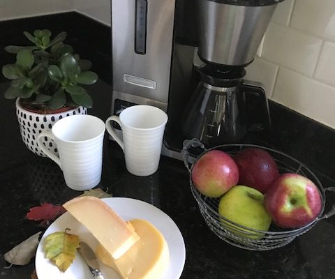
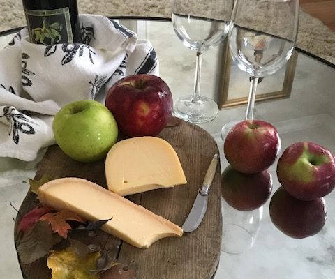
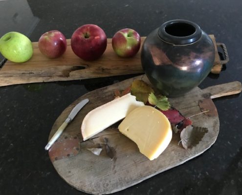
You can think the same way about your space (or your life, for that matter). If you don’t like what’s on that wall, change it. If you don’t like that wall, get rid of it. If something worked for you once and doesn’t any longer, replace it. If anything at all makes you uncomfortable, fix it.
You’re Not Alone
Part of the reason we resist or fear change is that we think we have to face it alone. We don’t. If you want to change your space and don’t have the time to wade through all your options, call us. We’ll help you narrow them. And we’ll help you bring your taste and style to reality.
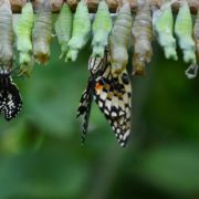
But whatever you do, keep the change. If all of nature were so resistant to it, we’d never have butterflies.