Size Matters

Recently, while searching through Work Design Magazine, I came across two articles that could have been about my husband and me. I don’t mean to suggest we were mentioned by name or anything. It’s just that they seemed to celebrate the differences in our working styles; although, the first one was a tad more cryptic than the second. But more on that in a moment.

I work best when I’m connected with nature, when filtered sun streams along my desk, when my eyes can take a break from my computer screen and look at my thriving plants. I need a little background noise and some occasional white space (which I define as a kind of general emptiness) to clear my artistic mind when it gets a little too cluttered.

My husband, on the other, who’s a writer, works best in seclusion, in quiet spaces with absolutely no distractions, visual or aural. His thought process is like a train in a tunnel: He runs on a single track toward the light at the end, with complete focus. As you might imagine, we have frequent philosophical discussions about the difference (if any) between concentration and obsession. I won’t tell you which of us takes which side of the discussion. 😉

Can you imagine both of us having to work in the same office? Neither can we.

That’s What Makes Horse Racing

We’re all different, with different styles, preferences, desires, and predilections. So, when it comes to work environments, why do we think one size will fit all? And that question brings me back to the two Work Design Magazine articles.

The first one, from April of last year — “World’s Top Performing Workplaces: How The Best Beat The Rest” — cited a study by Leesman that surveyed 151,770 employees across 971 workplaces worldwide that concluded:

People favor variety in their workplace [sic] … workplaces that score highly feature working areas that accommodate all sorts of tasks … greater variety comes at the expense of personalization … better manage a wider variety of workplace designs, are organizations denying their employees the opportunity to personalize space?

So, that means … well … we’re not exactly sure what it means, since it contradicts itself and ends with a question. Let’s move on to the second article, shall we?

The second article, which ran in May of this year — “Thoughtful Design Methods To Foster The Wellness-Minded Workplace” — was a little more concrete and confident in its findings (Whew!):

By integrating work choice into design, organizations can support day-to-day processes and foster individual wellbeing while encouraging social connections through design … investing in employee health and fitness can lead to unity across the workforce, emotional wellness, a sense of responsibility, increased productivity and increased employee loyalty.

Okay. Health and fitness notwithstanding, that article affirms what common sense already indicated: By accommodating the ways in which people prefer to work and interact, they’ll be happier, get more work done, and be more likely to stick around.

The moral of the story is this: If you or your people aren’t happy with your workspace, change it.

We might be birds of a feather. But we’re not pigeons.

It’s Not About the Box

Leafing through the April edition of Home Accents Today, I saw an article called, “Thinking outside the design box”. I suppose (hope) the author intended some irony in the title because the article was about thinking outside the design box by purchasing designs in a box. According to the article, the process works like this:

Decorator in a Box is exactly what it sounds like … you complete a questionnaire about your style, color preferences and what you are envisioning for the particular space you are decorating … you submit photos of the space … you submit measurements of everything … you purchase your box based on the room(s) that you are designing … The box comes wrapped with a bow and a hand-written note.

Call me crazy (or self-serving), but that describes a product. That’s a little tough to wrap my head around because the purpose of The ArtFitters isn’t to deliver a product. Our purpose is to deliver a service. And we can’t deliver it in a box. We have to — we choose to — deliver it in person, on-site, and in constant communication with our clients. Packaging a product in a box may be some kind of science. But delivering a service — our service — is an art.

What’s In the Box?

I have a cousin who’s allergic to almost everything. That makes choosing furnishings for her home daunting, to say the least. She was recently in the market for area rugs. She bought some online. The ones she bought came with removable underlinings that permitted the surfaces of the rugs to be put in the washing machine. “These will be great for my allergies,” she said. “I can pull them up and wash them whenever I want.”

Not so much. First, the company’s marketing information neglected to identify the chemicals used in its dyes (to which my cousin was allergic, of course). Second, when she washed the rugs (within the first 24 hours after pulling them out of the box), they held so much water she didn’t have the strength to pull them out of her washing machine. Third, the rugs weren’t returnable since they were ostensibly custom made for each purchaser.

Ouch.

We Can Doesn’t Mean We Should

Imagine a world in which we can find just about anything we want with a few keystrokes, buy it with a few keystrokes more, and have it delivered (in a box, of course). We did. It’s here. You know what that world did? It turned almost every product into a commodity. But a service can’t be a commodity. And it most certainly can’t come in a box.

Design is personal. Good design reflects the person — the person’s style, lifestyle, and well being. The best design comes from the heart, not from a box.

“Gesundheit.” (Sorry. My cousin just sneezed again.)

Up Close and Impersonal

We were at a home a while ago to perform a staging assessment. The home was owned by a pleasant young couple. Since they’d bought their home, they’d had two beautiful children. As a result, what they’d always intended to be their starter home was now bursting at the proverbial seams. It was time for them to move.

The walls told us what wonderful and proud parents they were, about every trip they took, when they got married, what their hobbies were, and more. The walls told of the children, too — a list of jobs well done, gold stars, and the artwork they’d created incorporating construction paper, crayons, and lots of blue clouds.

What we had to tell them was considerably less joyful: “Don’t make this personal.”

Take a Step Back

Staging your home is really visual merchandising, the unwritten way to appeal to prospective buyers. Likewise, staging your workspace is a way to appeal to prospective employees, prospects, and customers. As a marketing tool, staging has to be inviting enough to attract people. But it also has to be impersonal enough to allow people to imagine themselves in the home or the workspace.

Every personal aspect of the property says you, not them. It distracts them from imagining themselves in the space. It detracts from your ability to sell or lease the space. And it subtracts from the value you’ll get from the space.

In fact, in a recent survey, the National Association of Realtors researched the effectiveness of staging from the perspectives of sellers and buyers. From the perspective of sellers, the survey found:

  1. 85 percent of staged homes sold for six to 25 percent more than un-staged homes.
  2. 68 percent of those homes sold for at least nine percent more than their neighbors’ un-staged homes.

From the perspective of buyers, the survey found:

  • 49 percent said staging increased the value.
  • 77 percent said a staged home made it easier for buyers to see themselves in it.

Enjoy the View

The young couple whose home we assessed was also quite gracious. They took our advice … and didn’t take it personally. They packed up everything that had personal meaning to them, put the children’s toys away, removed the clutter, and prepared their home and themselves for their next chapters.

As part of our standard staging program, we sent the couple our complete assessment, along with a list of to-dos. We also sent a note of apology for the de-personalizing. Shortly thereafter, we received a thank-you note from them. In the note, they let us know the staging process had given them some insight they’d use in purchasing their new home.

That one they can make very personal.

Hold the Pickle

This post is for all of my friends, acquaintances, and connections who are residential realtors.

I read a post on Your Modern Cottage recently — “We Buy Homes the Way We Buy Hamburgers” — that presented a slightly different flavor (no pun intended) to home staging. The post said this, in part:

Most people buy (or sometimes build) their homes the way they buy their cheeseburgers.  On the whole, people base their purchasing decisions on marketing, convenience, and price point. Many agonize about the location, thanks to the famous realtor marketing slogan – “location, location, location.”  Yet, very few people spend the time and effort researching if their future home will truly work for them, their families, and their future.

Whoa! That’s one of those statements that makes you stop to see what’s in the bun.

The Secret Sauce

Here’s something that’ll flip your burger: I’ll concede right upfront my vested interest in having you hire The ArtFitters to stage the homes you sell. There. I said it.

But I’ll support the objective wisdom of that interest by citing some statistics from your peers, courtesy of the National Association of Realtor’s 2019 Profile of Home Staging:

  • 48 percent of buyers’ agents said home staging had an effect on buyers’ views of homes.
  • 83 percent of buyers’ agents said staging a home made it easier for buyers to visualize properties as future homes.
  • 28 percent of sellers’ agents said they staged all sellers’ homes prior to listing them.
  • The most common rooms staged included living rooms (93 percent), kitchens (84 percent), master bedrooms (78 percent), and dining rooms (72 percent).
  • 10 percent of respondents said buyers felt homes should look the way they were staged on TV shows.
  • 38 percent of respondents said TV shows that showed the buying process had an influence on their businesses.

At risk of mixing my meal metaphors, how do you like them apples? Staging will help you sell more homes, more quickly. And it won’t leave prospective buyers wondering, “Where’s the beef?” In that sense, it just might be the real-estate equivalent of fast(er) food.

To paraphrase the old Burger King commercials: When you’re selling, don’t forget us/Special orders don’t upset us.

Call us before you get yourself in a pickle.

Point of VIEW

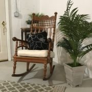
This is not your grandmother’s rocking chair. That’s because it’s my grandmother’s rocking chair. Aside from the facts that (1) I’m shamelessly sentimental (2) value is subjective, and (3) the value in that chair is the familial heritage it represents, I couldn’t part with that chair because it’s simply beautiful. And its beauty notwithstanding, that elegant piece of furniture has not outlived its utility.

It’s soundly constructed. It’s been well cared for. It’s surprisingly comfortable. And, exactly as its makers intended, it manifests its utility by providing a place to sit. Much like Charlie Brown’s Christmas tree, all it needed was a little love.

It Depends How You Look At It

Since perspective is everything, I decided to coin a term for my perspective. Combining the first two letters of vintage and the second two letters of new, I call it VIEW. Since we apply VIEW to all of the the work we do in The ArtFitters, I decided to apply it to my grandmother’s chair by doing three very simple things:

  1. I oiled the wood to bring out its sheen and to prevent it from cracking.
  2. I purchased a new seat cushion to provide a little extra comfort.
  3. I purchased a new throw pillow to give it additional character.

I always expected my grandmother’s rocker to be usable. What I didn’t expect is that its utility would increase to the point at which it’s now the most-used prop in our residential-staging inventory.

What a Difference an Attitude Makes

It’s helpful to remember attitude has more than one meaning: It can mean your manner, your disposition, or your feeling about something. It can also denote the way you perceive or behave toward something. And that can make all the difference, especially as you determine the beauty, the value, and the utility of things.

You can call things old, or you can call them vintage. You can call things new, or you can call them un-used. It doesn’t matter. The only things that matter are your attitude toward those things and the way you use them.

It’s all in your point of VIEW.

This Isn’t a Job for Superman

There comes a point at which you could almost get tired of beating up on the self-defeating shortsightedness of open office designs. Almost.

The fact is, when an idea does itself that few favors, it gets what it deserves. The bad news is it encourages all manner of piling on. The good news is it also inspires alternatives that include new ideas, new products, and new design alternatives. So it is that open office spaces have precipitated the return of, of all things, the cubicle. But, to paraphrase the old ad that sought to stave off Oldsmobile’s demise but served only to hasten it by flaunting the GM line’s irrelevance, this is not your father’s cubicle.

So ubiquitous is the open-office bashing — and so rife the opportunities — Fast Company published an article entitled, “Cubicles are back, and we have open plan offices to thank”. Wow.

Who’d have imagined an idea once championed by so luminous an architectural figure as Frank Lloyd Wright would come to be the impetus for conflict, high blood pressure and increased staff turnover, to say nothing of its complete lack of accommodations for privacy and concentration.

The Fast Company article said, in part:

Call them pods. Boxes. Micro-offices. Phone booths. Cubicle nouveau. There’s no one name for them, but they all aim to fix the same problem: the misery of the modern open plan office … open offices are bad for the people who work inside of them … [because of] their psychological and social costs.

What Goes Around …

Everything is cyclical. So, it was only a matter of time until open offices went the way of dinosaurs, the Ford Pinto, Quaaludes, and pet rocks; although, open offices will be back again as soon as enough time passes and we ignore enough history.

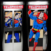
Even our currently renewing infatuation with the office phone booth won’t last long. After all, we’re only human. And even though Superman had powers and abilities far beyond those of mortal men, not even he was as crazy about phone booths as we think he was.

But when the choice is between close quarters or the psyche-restoring respite of seclusion, it’s no contest. And lest we forget, Superman called his sanctuary the Fortress of Solitude.

Let’s look at it this way: The fact that phone booths went away doesn’t necessarily mean they were a bad idea. They’re coming back because open office spaces have to go.

What’s Old is New Again

The other morning, my husband and I were reading a humorous article about the days when we, as kids, could hop on our bicycles after school, knowing the only admonishment we’d receive was, “Don’t come home till supper.” After we got through laughing, reminiscing, and recalling our youthful days with a kind of wistful nostalgia, I realized how much freedom we had had back then. We had such amazing opportunities to imagine, to explore, to make decisions, and to think independently.

I’d get on my Columbia bike and pedal my way to adventure, looking to see what I could find along the way, what treasures I could bring home to my mother. I saw beauty in Queen Anne’s Lace and other wildflowers, in acorns, pinecones, and horse chestnuts. All these things I’d carry home to arrange into something worthy of my creativity. After all, that stuff was there for the picking, right alongside the road.

But the real finds were in the bulky waste pickup. Those were the days in which adaptive reuse was called dump-diving. And I was plunging in head first. I remember being so excited the time I found a really great frame. It was just waiting to come alive with a fresh coat of paint and a family picture. I got a lot of brownie points for that find.

The Past is a Present to the Future

All that fun I had creating memory lane on my bicycle informs the work we do at The ArtFitters today. We find new uses for things that frequently have been forgotten. We have a keen, practiced eye for placing unlike things together, in creating wholes that are so much greater than the sums of their seemingly disparate parts, in turning adaptive reuse into eclectic design.

As a child, I strove to surprise my mom with things that would please her. Today, The ArtFitters strive to surprise our clients with things that please them.

We all search for our purposes in and our contributions to life, to create meaning in and fulfillment through our work. Sometimes our efforts are thwarted by peer pressure, by a lack of self-faith, by misplaced desires to make others happy or to make money. But sometimes …

Years ago, I read What Color is Your Parachute. It told me to look at what I loved doing as a child.

If I’d read that book while riding my Columbia, I’d have saved a lot of time.

Talk Talk

In an odd moment of cultural and artistic dissonance, two things found their way into my senses sequentially the other day, followed by a related thought. First, in my Facebook feed, a friend had posted the 1966 garage-band, proto-punk classic, “Talk Talk“:

Here’s the situation
And how it really stands
I’m out of circulation
I’ve all but washed my hands

The phrase that struck me was, out of circulation, emphasizing, as it does, the song’s abiding senses of isolation and frustration. I wondered if the lyrics were written with deliberate irony since there seems to be some pretty clear cause and effect there: If you’ve removed yourself from social interaction — and abdicated your responsibility for that removal — frustration and loneliness are pretty much all that’s left.

Shift Gears

The second thing that crossed my neural pathway was an article in Artsy: “Visiting museums and galleries is a popular way to de-stress, according to a new study“. It was a breath of fresh hope after the bleak paranoia of “Talk Talk”:

The British nonprofit Art Fund found … 63% of U.K. adults “used a visit to a museum or gallery to ‘de-stress” … Those who do visit museums and galleries regularly … “report a greater sense of satisfaction with their lives … as well as a greater sense of their lives and what they do being worthwhile.”

My inner pragmatist recognized, of course, that it might not be practical or possible for some people to visit museums regularly. But perhaps it’s not the museum that engenders greater senses of satisfaction. Perhaps it’s the artwork. And maybe paintings in a museum might not be the only source of art that engenders relief from stress and greater senses of self, satisfaction, and sufficiency. It’s just as possible as anything else that songs or stories might make us feel similarly, peacefully fulfilled. Then I had my thought.

What If …?

As I contemplated the juxtaposition between the sentiments of “Talk Talk” and those in the Artsy article, I recalled a quote I once read from Dr. Karl Menninger:

I tell myself to listen with affection to anyone who talks to me. This person is showing me his soul. It may be a little dry and meager and full of grinding talk just now, but soon he will begin to think. He will show his true self; he will be wonderfully alive.

That made me think that the sense of satisfaction engendered by art could be enhanced by social interaction, by the exchange of thoughts, impressions, and sentiments in conversation. And it made me wonder if, rather than encouraging their people to visit museums, employers could invite and encourage their people to participate in sharing sessions.

What if, once a week, people were invited to sessions with their co-workers to share paintings, songs, stories, or other works of art? What if such sessions created opportunities to get to know each other in different ways, on different levels? What if they were able to discover — on their own, in their own ways — that the magic of business is people?

There It Is

Let’s not forget there are multiple definitions of commerce:

commerce (noun)
  1. an interchange of goods or commodities … trade; business.
  2. social relations, especially the exchange of views, attitudes, etc.
  3. intellectual or spiritual interchange; communion.

If we treat #2 and #3 as being at least as important and meaningful as #1, we’ll be putting some seriously substantive commerce into our businesses. If we enable our people to show their true selves, to be wonderfully alive through the discussion of arts of all sorts, we’ll be doing our selves, our people, and our businesses a true service.

And we’ll be walking the talk talk.

Keep the Change

Change. I can’t think of anything so inevitable or so vital to our growth, to our fulfillment as human beings. But as human beings, our natures often tend to resist change. Why is that?

In part, it’s fear of the unknown. If you’re familiar with the expression, the devil you know is preferable to the devil you don’t know, you’re aware of the fact that our fear of change often supersedes our desire to change. Maybe we’re afraid of making bad choices. Maybe we’re afraid of failing. Maybe we’re overwhelmed by the sheer number of our options.

Since we have so many sources of information, of new ideas, of products, services, or anything else we might want, how do we know which one’s right? The challenge of making a decision, of selecting an option, of choosing to change takes on a life of its own. That’s as costly as it is unfortunate.

But what if there is no right or wrong?

That’s Life

What if, rather than right or wrong, we accept change as being constant? What if it’s simply an element of life and living. Maybe change is not a choice. Maybe it just is. Maybe it’s not just one choice. Maybe it’s an ongoing series of choices. Maybe it’s not a challenge. Maybe it’s actually an opportunity to do everything differently, again and again, to keep everything fresh, engaging, and new.

As an artist who paints in oils, I can tell you no stroke I apply to canvas today will be dry tomorrow. I can change it. What could be more liberating than that? If I like it tomorrow, I’ll leave it. If I don’t, I’ll change it. I just roll with my thinking and make changes (or not) without pressure.

You can think the same way about your space (or your life, for that matter). If you don’t like what’s on that wall, change it. If you don’t like that wall, get rid of it. If something worked for you once and doesn’t any longer, replace it. If anything at all makes you uncomfortable, fix it.

You’re Not Alone

Part of the reason we resist or fear change is that we think we have to face it alone. We don’t. If you want to change your space and don’t have the time to wade through all your options, call us. We’ll help you narrow them. And we’ll help you bring your taste and style to reality.

But whatever you do, keep the change. If all of nature were so resistant to it, we’d never have butterflies.

Let There Be Light

I’m worried. Are you?

I’ll tell you why I’m worried: Progress and evolution are beautiful things. If we’re not marching forward, we’re moving backward. I get that. But what I don’t get — and what worries me — is that all of our ostensible progress and some of the directions in which we’re evolving are taking us away from our own natures, from our own biology and physiology.

Does that sound overstated? Does it seem crazy? Maybe. But overstatement and crazy don’t explain this: “The #1 Office Perk? Natural Light“:

Access to natural light and views of the outdoors are the number one attribute of the workplace environment, outranking stalwarts like onsite cafeterias, fitness centers, and premium perks including on-site childcare … the absence of natural light and outdoor views hurts the employee experience. Over a third of employees feel that they don’t get enough natural light in their workspace. 47% of employees admit they feel tired or very tired from the absence of natural light or a window at their office, and 43% report feeling gloomy because of the lack of light.

It Gets Worse

As if that kind of statement-of-the-obvious being positioned as reportage weren’t alarming enough (it is), there’s this: “The Growing Influence of Biophilic Interiors“. I can’t even tell you how much I wish I were making that up. I’m not:

Biophilia can be described as an affinity with nature and natural environments. In relation to interiors, biophilia brings the outside in by placing elements of nature within a hospitality environment. Examples of this are allowing a greater amount of natural light into the space or developing green environments including horticulture as this can create a fresh ambiance.

The logic of that piece is something along these lines: We as human beings — as creatures of nature — want and need other elements of nature like light and plants. Really? If we’ve reached the point at which we need to be told those things, I’m even more worried than I thought I was.

Let’s Fix This

Creating the right working or living space doesn’t need to be anywhere near this complicated or pseudo-scientific. All we have to do is:

  1. Start from the awareness that we’re creatures of nature with natural biological and physiological needs.
  2. Agree on the elements that will best meet those needs and suit our individual tastes and styles.
  3. Work together to create the space that fulfills 1 and 2.

If we do that (we absolutely can), it’ll definitely be a ray of light, won’t it?

And I’ll be much less worried. Won’t you?